ShopDreamUp AI ArtDreamUp
Deviation Actions
Daily Deviation
Daily Deviation
June 18, 2009
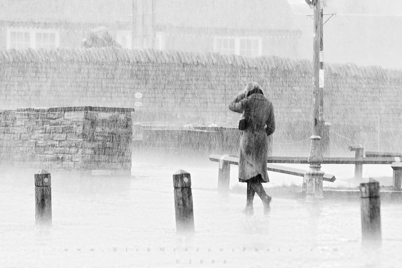
The Walk Home by *inshaala "demonstrates great strength of composition in spite of its opportunistic nature, and perfectly demonstrates the notion of being "caught out" in harsh conditions. Excellent in b&w, this is a top notch piece of photojournalistic work." - words by Meowgli
Also suggested by: =featkae.
Photojournalism > Natural Events
Also suggested by: =featkae.
Photojournalism > Natural Events


Comments120
Join the community to add your comment. Already a deviant? Log In
Aaah so nice to see this here <img src="e.deviantart.com/emoticons/s/s…" width="15" height="15" alt="
I remember you've mentioned this was really a case of right place, right time, but the technique employed to realise this outcome is excellent. Since you know your way around a camera I'm going to assume the overexposure is deliberate, while the burning back in of the posts really makes them "pop" in the composition, which is pretty much spot on. Even the lamppost in the foreground, which some perfectionists might deem a slight distraction, adds robustness to the framing and balances nicely with the guy and the post in the background. The fact there is housing behind the wall really adds to the sense of being "caught out" as the warm indoors are clearly within reach, unlike if the scene was a downpour in the wilderness. Nice contrast in that respect..
I find something almost timeless about the way she is dressed and the tones you have used, and the hand to the head from both the passers has a drama which would have been lost had she casually had her hands in her pockets. Well, pretty much all praise so far... what would I change? Tricky one... not a lot to be honest. If we're getting right down to it and being ultra-picky on details, perhaps a slightly tighter crop from top and bottom would be good, cutting out that tiny bit of sky towards top right, and you could move the little circle at the top of the near post to the same side as the others. The lighter brick on the rear wall catches the eye, but it arguably serves as a compositional stepping-stone between foreground and background, so the merits of disappearing it are debatable.
But bear in mind I had to strain to think of those, overall I just love this shot, and hope that you don't mind too much your first critique is mainly full of praise!